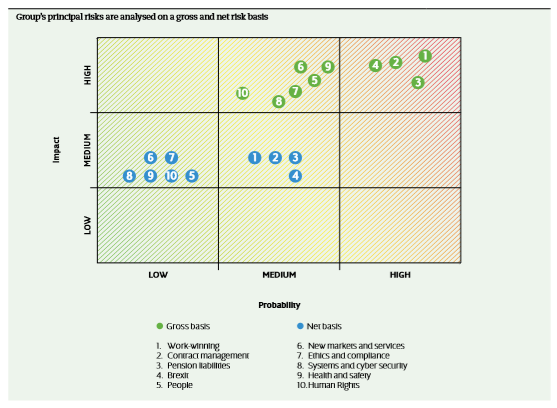
The liquidation of Carillion back in January 2018 made me reach for their last annual report covering 2016 and published in early 2017, just months before the profits warning in July 2017. I was interested in the risk management section of the annual report and in particular the risk heat map (see image). The gross risk levels looked pretty accurate in light of what unfolded but what made the senior management team, risk teams and auditors think that the residual levels were in any way accurate?